With every webpage loaded, email sent, or video streamed, network traffic takes a complex journey…

You know that feeling you get when you are about to paint a room a new color you’ve never tried before? There’s that moment where you stand there with a pit in your stomach, staring at the wall and the pan of paint, having a last minute argument in your head.
“It’s gonna be awesome.”
“But what if it’s not?”
“It’s time. We’ve outgrown this color.”
“Yeah, but everybody’s used to it.”
“Just do it. It will be fine.”
“Okay. I hope so.”
It can be pretty stressful. It’s the same for a product team rolling out a new UI…multiplied by a gazillion. But it was time so yesterday we rolled-out our new CloudReady UI.
And you know what? It is pretty awesome after all.
Why the change?
There are two reasons why we updated the user experience. First, because admins need to be able to respond to alarms quickly regardless of whether they are at their desk or on the move, our goal is to make the CloudReady interface fully functional on any device that can run a browser. To enable this, the new UI framework is responsive, meaning that it adjusts the layout dynamically to better support users accessing CloudReady from tablets, smartphones, and other small form factor mobile devices.
Second, the new UI framework provides a platform that will enable us to provide personalization features such as the ability to create and save multiple customized dashboard and sensor detail page views. You’ll see these new features begin to appear over the next several weeks.
Dude, where’s my menu?
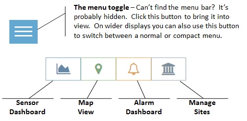
One thing experienced CloudReady users will notice (aside from the new color scheme) is the new left hand navigation/menu bar. The good news is that all the previously available menu items are still there, but the menu bar does a better job of highlighting the particular menu items associated with the current view, and will dynamically resize/hide itself based on the available screen width.
In addition, there are some new shortcut buttons you’ll want to become familiar with:

If you haven’t already, we hope you’ll log in or sign-up for CloudReady and give this new user experience a try. Like that paint job, there are a couple of drips here and there that need to be touched up, but we’re confident you’ll find the new menus and responsive layout useful. We’d love to get your feedback. Drop us a line at success@exoprise.com!


