With every webpage loaded, email sent, or video streamed, network traffic takes a complex journey…
They’re a key part of your cloud management toolkit.
Which ones make the grade and which ones fail?
When you deploy cloud based apps in and services in your organization you quickly find that your traditional tools and techniques for monitoring don’t give you sufficient visibility into the health and performance of these services. We at Exoprise are laser focused on solving that problem for IT teams with CloudReady, and we believe that ultimately the only way for you to take control of cloud service levels is to actively monitor the entire service delivery chain connecting your users to the apps in the cloud.
As we’ve previously highlighted, cloud service provider status dashboards are no substitute for data you get from monitoring at your user locations. The dashboards can only tell you how the service provider’s delivery infrastructure is working. They can’t tell you if something outside their environment is affecting service availability and performance in your environment.
Still, these dashboards are an essential part of your cloud management toolkit, and with this in mind I decided to survey the dashboard landscape to see what the major providers offer. Some providers have definitely oriented their status pages toward the needs of IT teams. Others, not so much.
Dashboard Requirements for IT
To be useful as an operations tool, IT teams need the following:
- Granular Real-Time Status – Most of these services are comprised of smaller sub services (e.g. admin functions v. user functions) and are delivered from multiple datacenters. It’s not enough to simply have a binary “we’re up” or “we’re down” statement. IT teams need to know which specific areas of the service may be having issues.
- Granular Historical Status – Post-mortem analysis is a recurring activity in an IT team. If there is a significant service incident, management will often want to see a report citing the details. The ability to see service incidents and availability stats for the past 30 days or more is valuable for this analysis.
- Detailed Service Incident Notes – If the provider is experiencing a problem or is performing maintenance, IT admins need to be informed of the nature, scope, and user impact of the problem so that they can effectively communicate and manage expectations with their users and management teams.
- Data Feed / Subscription Capability – A status page allows IT teams to “pull” information but you really want updates to be “pushed” to you via email, RSS, or some other mechanism so you know what’s happening as soon as possible.
So, how do the major cloud providers stack up against these criteria? Let’s take a look.
The Class President: Microsoft Office 365
https://admin.microsoft.com/#/healthoverview
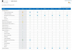 | Real-Time Status: | Yes |
| Historical Status: | Yes | |
| Service Incident Notes: | Yes | |
| Data Feed / Subscription: | RSS, API, Mobile App, SCOM |
Microsoft Office 365 is the clear stand-out in this group. Its service health dashboard is accessed within the extensive admin portal. You do have to log in to get to it, and according to Microsoft, by doing so they are able to provide you with information specific to infrastructure used by your tenant.
Microsoft also provides a public facing page, which states the general state of service health except in the case of an issue that prevents users from logging into the admin portal, in which case Microsoft indicates that they will put additional details on this public accessible page.
While the dashboard itself satisfies the four core requirements cited above, Microsoft is going well beyond the web and RSS mechanisms for communicating with IT teams. They have recently updated their admin app for iPhone, Android, and Windows Phone and Service Health API (which is being integrated into CloudReady). At this year’s Ignite conference in Chicago they also indicated their plans to further enhance the way they communicate with IT teams.
This level of commitment to the needs of IT is unique among SaaS offerings and on par with you typically see with IaaS. This is what sets Office 365 apart.
The ‘A’ Students
Microsoft Azure, Amazon Web Services (AWS), Google Apps, and Ping Identity are all very similar in their capabilities and UI’s, with tables of rows corresponding to service components and columns showing historical status. Status indicators in the cells show incidents and clicking on an indicator will bring you to a detailed write-up on the incident.
Ping Identity, while making it somewhat more difficult to access service incident notes, does add two features that stand out. First, they provide a robust set of ways to subscribe to status updates with support for email, SMS, RSS, and webhooks, making it easier to find a delivery mechanism that works for you. Second, Ping Identity provides running metrics for service response times for their services; useful data for admins trying to troubleshoot performance problems from their locations.
Microsoft Azure
http://azure.microsoft.com/en-us/status
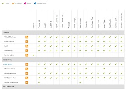 | Real-Time Status: | Yes |
| Historical Status: | Yes | |
| Service Incident Notes: | Yes | |
| Data Feed / Subscription: | RSS |
Amazon Web Services (AWS)
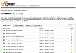 | Real-Time Status: | Yes |
| Historical Status: | Yes | |
| Service Incident Notes: | Yes | |
| Data Feed / Subscription: | RSS |
Google Apps
http://www.google.com/appsstatus
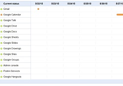 | Real-Time Status: | Yes |
| Historical Status: | Yes | |
| Service Incident Notes: | Yes | |
| Data Feed / Subscription: | RSS |
Ping Identity
https://status.pingidentity.com
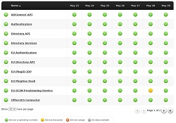 | Real-Time Status: | Yes |
| Historical Status: | Yes | |
| Service Incident Notes: | Yes | |
| Data Feed / Subscription: | Email, RSS, SMS, Webhook |
Almost But Not Quite There
Concur, Box, and Salesforce are clearly trying to provide sites that help IT teams, but they each lack one or more of the four IT requirements. Concur’s dashboard is very similar to those of Amazon and Microsoft, but doesn’t seem to provide any way to get the data pushed to you. Box is known for Spartan yet effective UI’s and their status page is no exception, but it needs a historical view of status. The Salesforce status page has fancier visualizations than product itself, but across the board it falls short in the useful information it provides. The RSS feeds for each Salesforce instance are much more useful.
Concur
http://concuropenstatus.concur.com/
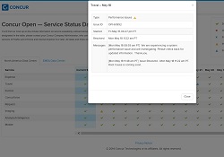 | Real-Time Status: | Yes |
| Historical Status: | Yes | |
| Service Incident Notes: | Yes | |
| Data Feed / Subscription: | No |
Box
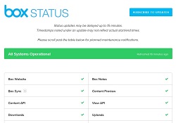 | Real-Time Status: | Yes |
| Historical Status: | No | |
| Service Incident Notes: | Yes | |
| Data Feed / Subscription: | Email, RSS, SMS, Webhook |
Salesforce.com
https://status.salesforce.com/
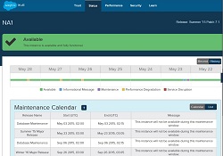 | Real-Time Status: | Partial |
| Historical Status: | Partial | |
| Service Incident Notes: | Partial | |
| Data Feed / Subscription: | RSS |
Falling Behind
This next group, DocuSign, Okta, and OneLogin, is characterized by status dashboards that seem to be driven more by Marketing than Customer Support or Operations. The pages are usually very visually appealing (Okta’s in particular) and promotional, with statements about how good their uptime has been historically. However, they are also all very lean on useful information for IT teams. Even the RSS feeds seem sparse compared to the information provided by Microsoft, Amazon, and Google.
Don’t get me wrong. These are all great services that operate very well. They just need to provide IT teams with status dashboards that focus on operational needs rather than promotion.
DocuSign
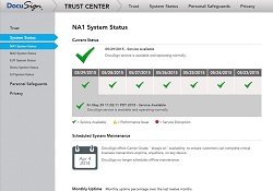 | Real-Time Status: | Partial |
| Historical Status: | Partial | |
| Service Incident Notes: | Partial | |
| Data Feed / Subscription: | No |
Okta
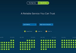 | Real-Time Status: | Partial |
| Historical Status: | Partial | |
| Service Incident Notes: | Partial | |
| Data Feed / Subscription: | RSS |
OneLogin
https://www.onelogin.com/why-onelogin/trust
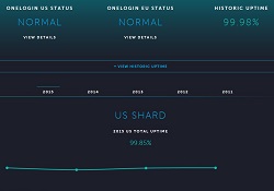 | Real-Time Status: | Yes |
| Historical Status: | No | |
| Service Incident Notes: | Partial | |
| Data Feed / Subscription: | Email, RSS, SMS, Webhook |
#FAIL
Of the sites I surveyed only two, Marketo and Dropbox, failed to satisfy any of the four core IT team requirements. At the time I checked, it did not look like Marketo’s page had been updated for over three weeks. The prize for the least useful status page, however, goes to Dropbox. I features one giant PNG image. That’s it. To be fair, I’m not even sure the Dropbox team considers this to be their official status page. I found it by searching on Google. At the same time I found this help center article, which makes no reference to this status page and indicates that the preferred ways to learn about status changes are their forums and Twitter feed. Twitter is definitely not a viable service monitoring solution.
Again, these are both great services, and it’s surprising to see so little investment in their dashboards. I’m actually hoping I get called-out and shown that they do have something better than what I found. If so, I’ll happily adjust their grade so they don’t have to retake SaaS Dashboard 101. 🙂
Marketo
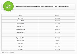 | Real-Time Status: | No |
| Historical Status: | No | |
| Service Incident Notes: | No | |
| Data Feed / Subscription: | No |
Dropbox
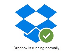 | Real-Time Status: | No |
| Historical Status: | No | |
| Service Incident Notes: | No | |
| Data Feed / Subscription: | No |
Conclusions
There are many factors to consider when choosing a cloud service. Is the quality of a provider’s health dashboard a make or break capability? Probably not. However, it does reveal the level of investment the provider is making in to tools that enable you as an IT administrator. The more critical the application is to your organization, the more important these admin capabilities will be, so it’s important to understand how the provider will communicate service status information to you so you in turn can effectively manage the service for your users.


